Please note: All new registrants to the Panopto Community Forum must be approved by a forum moderator or admin. As such, if you navigate to a feature that is members-only, you may receive an error page if your registration has not yet been approved. We apologize for any inconvenience and are approving new members as quickly as possible.
Thumbnail progress bar
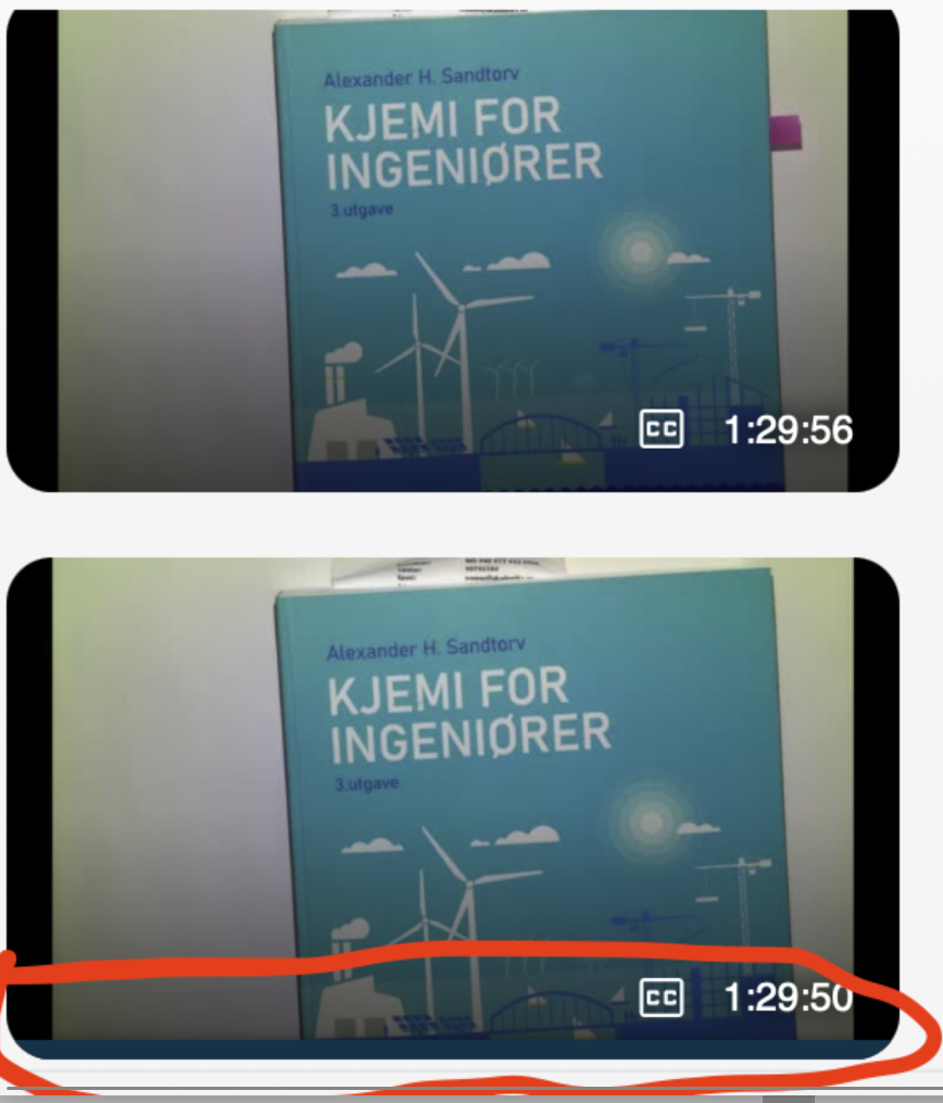
The recent change to the thumbnail progress bar makes it very hard to see some times. We have already got complaints from students saying it is hard to tell what they have watched and not.
This is a picture a student took to show the issue. One of them has been watched, the other not.
Could you somehow make the contrast better? Obviously it was easier to see the bar before this 'Product improvement' as you call it in the Service update description:
Thanks,
// Vegard
1


Comments
Yeah, I'm honestly not sure why this was changed in the way it was. If this bar was something where we could set it to be a brighter brand aligned color, I could see it being OK potentially, but the way it exists right now just fit the need.
The reason the YouTube solution works is because it's a bright red bar. If we were able to set a similarly bright color that aligns with our individual brand guidelines, this could be an OK solution.
In my opinion there are two options moving forward, and one should be done ASAP: